Classic videogame designs meet modern art in Please, Touch the Artwork

The appeal of Thomas Waterzooi’s debut game Please, Touch the Artwork is more than just its white-walled art gallery set dressing. It’s one part psychogeography and one part “zen” art puzzle collection, but also a full-fledged descendant of classic videogames like Snake and Pong.
Despite its outwardly chill vibes, Please, Touch the Artwork is a challenging game that taps into the same hypnotic, obsessive vein of commitment as Snake, the smartphone staple preloaded on a billion Nokias in the late ’90s and ’00s. In Snake (which you may know as Nibbles, a variant that shipped with MS-DOS), your snake grew after consuming dots on a tiny monochromatic screen, and once you ate your own lengthening tail it was game over.
Phone games were so rare at the time Snake became a shared experience that defined a formative period of mobile phone culture and the idea of what a casual game could be. Please, Touch the Artwork isn’t a Nokia game (though it is available on smartphones as well as Steam and itch), but it reaches back into history to pull at the same threads that made games like Snake and Pong so appealing.
Waterzooi uses lines, blocks, primary colors, and negative space to create a minimalist wall on which to project ideas—it isn’t just about getting from point A to point B, but imbuing your explorations with meaning. In the Boogie Woogie gallery you’re introduced to two “characters” (really just points on a screen) and the rules that govern their relationship, while in the New York City gallery your movements mimic the hustle and bustle (and at times, isolation) of living in a big city.
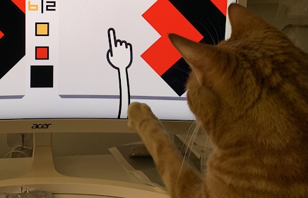
Using the abstract art of Dutch artist Piet Mondrian (you almost certainly know it even if you don’t know his name), Waterzooi makes a layered homage to art history that taps into our innate attraction to crisp shapes and bright colors. The slappy-hand cursor also attracts cats.

(Image credit: Alexis Ong)
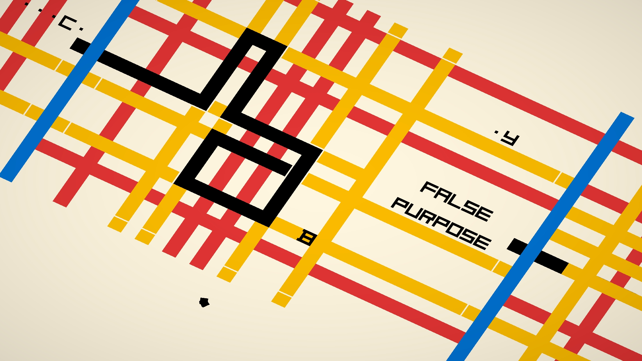
The psychogeographical aspect is strongest in the New York City gallery, which interweaves Snake-like puzzles with a loose poem about a decaying relationship. By far the most conventional linear narrative in the game, it’s also the most conceptually coherent. While the inspiration is clearly from Mondrian’s New York City series of paintings, it also brings to mind Massimo Vignelli and Bob Noorda, who designed the iconic NYC subway map in 1967.
The minimalist setting immediately transported me back to 2006, when I moved to New York: navigating the MTA, mazes of one-way streets, and the rat-king of intense personal drama that is life in your early 20s. It’s a visual play that works even if you haven’t been to New York because, thanks to films and TV and books, the subway map has become a cultural representation of what we believe New York to be.

(Image credit: Thomas Waterzooi)
The journey through this particular depiction of New York outlines the familiar tale of a long-distance relationship where one partner moves to the big city: the feeling of socially overextending yourself to distract from dormant problems; the sense of comfort in each visit and the loneliness when the other goes back ‘home’.
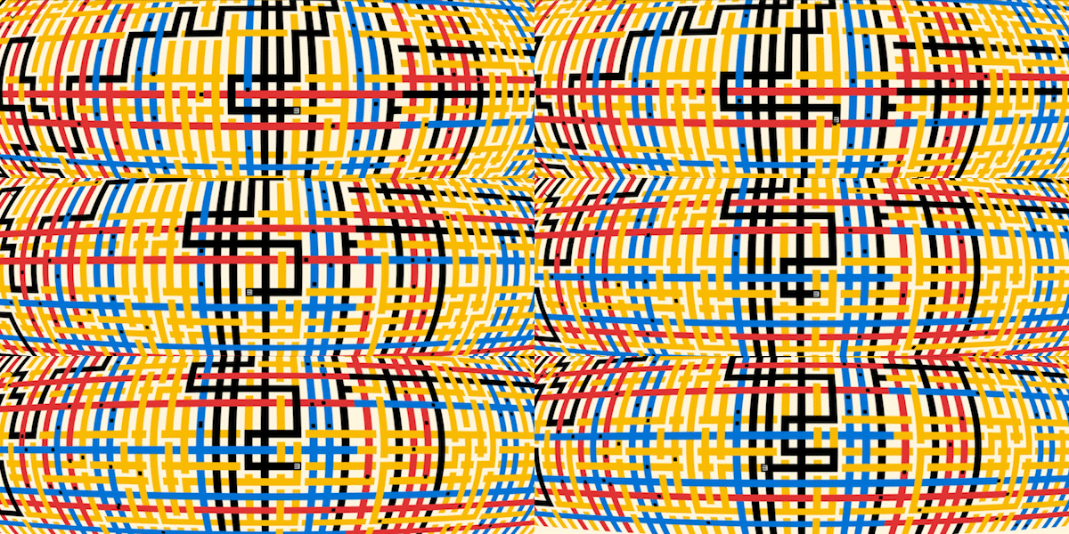
The colors and subway lines warp and wane over the course of the chapter—a claustrophobic fisheye lens effect, a dreary film of rain, a dim “wintery” period, and rhythmic cascades of commuters (stylized as dots) moving through the map add life to the grid. Some basic but effective framing tricks complement the ups and downs of the poem, like pulling out to reveal a massive, impersonal map, or having the camera tightly trained on your reticle, unable to pan around to see the big picture.

(Image credit: Thomas Waterzooi)
It’s a wonderfully effective—if slightly tedious, at least toward the end, as some relationships are—use of abstract art to tell a story that feels both personal and universal at the same time. The sense of visual and conceptual discord on the ‘maps’ is balanced as you travel through subway lines to the right nodes, revealing more of the poem and ultimately pushing the story along to its melancholy end.
The other two galleries aren’t quite as tightly constructed as New York (Boogie Woogie definitely wasn’t the most engaging of the three), but The Style is where I really felt the full brunt of the puzzles’ difficulty, as well as a great potential sense of Wordle-like community. In this gallery Waterzooi breaks down Mondrian’s Neo-Plasticism paintings, borrowing the painter’s visual language of simple geometry and primary colors to tell a theatrical story of creation (and eventually, a goodbye).
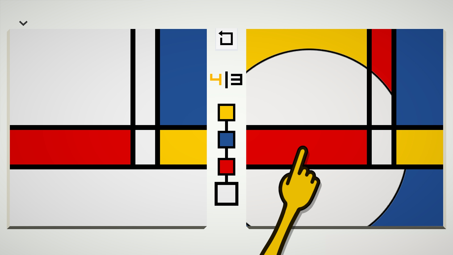
Mechanically, all you have to do is replicate a given painting on a blank canvas. It seems straightforward, until it isn’t.

(Image credit: Thomas Waterzooi)
Mondrian’s Neo-Plasticism movement was about using a common artistic language so that everyone was on the same page (no green, no curves, no masters). And so, armed with the same visual vocabulary, The Style plays the same siren song as Wordle—I can absolutely imagine doing one puzzle a day and comparing results with friends on a baffling colored grid. Playing the same thing separately, but together. We’ve moved from a grounded, geographical experience of place to a figurative shared space. And the puzzles do get fiendishly hard as they go along. There are diagonals, directional lines, and all kinds of things thrown in to make for a delightfully masochistic experience.
Of course, as a self-described chill “zen” game, Please, Touch the Artwork has no scores or metrics (though The Style does show you the perfect/optimal number of moves). There is no time limit. You can skip between galleries and visit them in any order you want, like meandering through the different wings of a museum. But coming away from it, there’s a distinct feeling that you’ve touched a part of art history in a brand new way, while also riding a zeitgeisty wave of small shared experiences told through simple visual language (hey, there’s that Wordle feeling again). I hesitate to call it “art Wordle”, and to be fair this shorthand description only applies to The Style, but it may be the easiest way to get you to try it for yourself.

